
Updated: March 15, 2024- tom@speedboostr.com
WHAT IS LAZY LOADING?
- Lazy Loading is a technique that loads elements as the user scrolls down the page, instead of during the initial page load.
- You experience Lazy Loading every time you scroll a feed on Instagram, Facebook or Youtube etc – images load in as you scroll down.
 The initial page load is referred to as the ‘page fold’, everything loaded here is ‘eager’ loading, whereas under the page fold (below the fold), after scrolling is ‘lazy’ – and this goes beyond images – scripts were also viable for many years, but now even theme sections themself can also be loaded in this way, due to the new Shopify section rendering API – this works awesome when combined with the intersectional observer API meaning you now get that native app feel we mentioned before – true load on scroll with support for third-party apps and code snippets, all in your mobile web browser!
We’ve not met a client that’s taken proper use of this yet, building a long instagram feed style store is totally viable now! Using this on a landing page would be epic for a merch drop or funneling from a campaign.
Jargon Buster: This is commonly known as “deferring offscreen images“ or “deferring render-blocking assets” and is required now as it’s related to TBT (Total Blocking Time) which is graded by Lighthouse in Google’s Core Web Vital Standards and displayed as part of your Pagespeed Insights – the performance is a factor in your page ranking.
The initial page load is referred to as the ‘page fold’, everything loaded here is ‘eager’ loading, whereas under the page fold (below the fold), after scrolling is ‘lazy’ – and this goes beyond images – scripts were also viable for many years, but now even theme sections themself can also be loaded in this way, due to the new Shopify section rendering API – this works awesome when combined with the intersectional observer API meaning you now get that native app feel we mentioned before – true load on scroll with support for third-party apps and code snippets, all in your mobile web browser!
We’ve not met a client that’s taken proper use of this yet, building a long instagram feed style store is totally viable now! Using this on a landing page would be epic for a merch drop or funneling from a campaign.
Jargon Buster: This is commonly known as “deferring offscreen images“ or “deferring render-blocking assets” and is required now as it’s related to TBT (Total Blocking Time) which is graded by Lighthouse in Google’s Core Web Vital Standards and displayed as part of your Pagespeed Insights – the performance is a factor in your page ranking.
Clients see a 5% ~ 50% improvement in TBT, FCP and LCP by implementing lazy loading. Which all helps the Speed Index overall.
Combined with our bespoke PSI Optimization, TBT can be reduced by 100% to zero lag instant timing.
✅ Best Practice:
For a store owner, this is an on-going threat and concern: To mitigate this you simply need to begin auditing your store, ideally before and after making design changes.
This is the best way to ensure you’ve covered all bases and had an expert check it. Contact us to schedule an audit and get a comprehensive assessment today!
. Important: The exact files to edit in your Shopify site will vary based on your theme, but generally you want to look for the template code that loads images, and swap in the lazy loading syntax explained by lazysizes (or whatever library you end up choosing). The key benefits from lazy loading come from deferring large graphics and product images.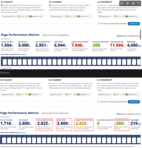 It’s important to note that this does require building for Mobile first performance and not overloading the network.
How Lazy Loading Works Under The Hood
Modern Browsers now support native lazy loading via the lazy img tag html attribute.
This is set on any img tag by adding loading=”lazy” or loading=”eager” e.g
<img src=”{{‘brand_logo.jpg’ | asset_url}}” loading=”lazy” />
Additionally for more support, and on legacy browsers – we also use the LazySizes library, which is used across the majority of Shopify stores, and is a free open source project with a decade of updates!
LazySizes works by checking the code pre-render (after it has loaded onto the device, but hasn’t been displayed yet.) It can then determine what elements to apply lazyloading or eager loading too.
To enable lazysizes, you need to add a CSS Class and data-src attribute like so:
<img data-src=”{{‘brand_logo.jpg’ | asset_url}}” class=”lazyload” />
To use it all together and support all platforms do the following:
<img
src=”{{‘brand_logo.jpg’ | asset_url}}
data-src=”{{‘brand_logo.jpg’ | asset_url}}”
class=”lazyload”
loading=”lazy”
/>
The benefit of using the lazysizes class is that this can be added to other elements such as iframes, script tags and videos.
👉 End result: Lazy loaded assets (images/scripts etc) don’t contribute to the initial page load, the page becomes unblocked, so your store’s content appears faster, and has a much more performant paint (FCP, LCP, TTFB) and blocking times (TBT, SI).
WHY IS LAZY LOADING AWESOME?
Consider this:
 Now let’s take a look at this example of a customer’s home page before and after implementing lazy loading, benchmarking was performed on a Mobile 3G connection in Virginnia using WebPageTest.org
BEFORE
 This customer has overloaded their page with a very intense graphic design, which equate to a 10.8 second speed index, and TBT (Total Blocking Time – the spinning wheel on a blank white background while the page is loading) is failing, with a 3.8s score!
AFTER
 A dramatic improvement is realized, simply by adding lazy loading to the images, and also adding some resource hints to help the render along, I was able to improve TBT to sub-second at 552ms but it’s still not fast enough for a pass grade.
Conclusion: Even with lazy loading achieving huge improvements across the board, it’s still not enough to hit a pass grade on the benchmark.
The client has to go back to the drawing board and reassess his decisions, in order to make a design that converts well and performs well also given the current technological requirements. It’s very common this happens, letting creativity flow and forgetting about the reality of the current technical parameters that cannot be moved. Bandwidth and processing power are defined constants that must be designed with to achieve success.
The fact of the matter is – fundamental technical restraints such as mobile connection speed, and mobile browser requirements simply cannot be overlooked when designing your store, even if you are not technically minded; they still apply and are critical in decision making.
HOW TO ADD LAZY LOADING TO YOUR SHOPIFY THEME
Option A) If you want our optimization experts to handle this for you, you can order our Shopify lazy loading service.
Option B) If you enjoy working with code and want to take a crack at it, start with the lazysizes library to implement on your site.
Read How to Safely Edit a Shopify Theme before editing your theme code. Summary: duplicate your theme before editing.
The detailed instructions to implement using lazysizes are on that page if you scroll down.
Sometimes you can run into problems, depending how the theme code is setup, but that’s part of the fun in learning 🤓
<img src="{{ IMAGE_URL }} ">
With the new lazy loading syntax, including the loading html attribute for browsers that do support it!
<img src=”{{IMAGE_URL}}” data-src="{{ IMAGE_URL }}" class="lazyload" loading=”lazy”>
To install the library, download the latest file from that lazysizes page, upload to your Shopify theme Assets folder and name it lazysizes.min.js, then include it in your theme.liquid <head> section like this:
<!--Lazy Loading -->
{{ "lazysizes.min.js" | asset_url | script_tag }}
<style>.lazyload,.lazyloading{opacity:0}.lazyloaded{opacity:1;transition:opacity.3s}</style>
*The <style> part is used to create a subtle CSS animated fade in effect.
Once you have the code setup, you’ll see your images fade into view as you scroll down your site, rather than all at the initial page load (you can also refresh this page and scroll down really fast to try and catch the affect here).
Lazy loading can usually speed up most of your site – Home, Collections, Product pages, and Blog posts all benefit.
When we implement lazy loading, most of your store is good for the future and will automatically lazy load images. In some cases there may require manual intervention for future elements, but we’ll explain if that’s the situation in your theme.
HOW TO CHECK IF LAZY LOADING IS SET UP ON YOUR WEBSITE
To see if you have lazy loading on your site, you can run it through the Shopify Analyzer.
 A second way to check is by inspecting the browser code by right clicking on your page, then selecting “View source”. Search for “lazy” on that page – if there aren’t any elements with “lazy” then you probably don’t have it.
If you view source and see some “lazy” elements, it’s still worth running through an analyzer tool to make sure they’re all loaded with “true lazy loading” (and not just “placeholder lazy loading”).
A second way to check is by inspecting the browser code by right clicking on your page, then selecting “View source”. Search for “lazy” on that page – if there aren’t any elements with “lazy” then you probably don’t have it.
If you view source and see some “lazy” elements, it’s still worth running through an analyzer tool to make sure they’re all loaded with “true lazy loading” (and not just “placeholder lazy loading”).
WHAT IMAGES SHOULD YOU LAZY LOAD?
You’ll get the most gains by lazy loading:
Sometimes you might see a warning in analysis tools for icons or small graphics – I would’t worry about these.
OPTIMISTIC UI
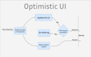 Lazy loading is just a piece in the puzzle of building a great user interface. An optimistic UI is the next logical step after adding lazy loading, and again you experience this whenever you use Youtube or any of the big apps as it’s become a industry standard now.
 Designing an optimistic UI means that as well as lazy loading in items, we display a loading indicator in the area before they arrive, and we also set fixed heights instead of using responsive design – to ensure no shifting occurs (as Google also benchmarks for this as part of core web vitals as the CLS)
LAZY LOADING AND SEO
When you lazy load images, your html image elements load normally. From a SEO and accessibility standpoint, the important alt attribute is still present for Google Bot and other spiders, so your images can appear in Google image search, and the most important factor is your pages load faster on Mobile with lazy loading. We recommend lazy loading for both performance and SEO as Core Web Vitals are now factored into the weighting algorithm for ranking your page, it’s more important to focus on building for Mobile First and having a Core Web Vital pass now in 2024. Lazy loading is built into all of the professional officially licensed Shopify themes that appear in the Shopify Theme Store, un-official themes may support lazy loading also. For more information on dialing in image SEO, this post will get you set up: Image SEO for Shopify – How to Optimize for Search Engines.WHAT’S NEXT?
If you want us to implement this for you, head over to our Optimization Services page and select Lazy Loading. If you landed here looking to optimize your Shopify store, here are the crucial starter tips for speed gains that you need to get done today:- Compress all your images with Crush Pics
- Make sure you’re using JPG image format instead of PNG for photographic images (PNG’s are often 2x – 10x larger for the same resolution)
- Make sure your theme doesn’t have janky code that makes the images load larger then you need (check in the inspect element – this is very common with older themes and un-official themes that are not downloaded from the Shopify Theme store)
- Run your site through the Shopify Analyzer to see what optimization opportunities you have, and how to approach them
- If you’re feeling ambitious, check out our full performance optimization guide: How to Optimize a Shopify Site.
Hi – I know I’m late to the party… but can you explain one thing – I have looked everywhere without much help. When we create the srcset with multiple imge size – what piece of software actually creates the various version of the image? When we first upload the image in shopify it may have dsay a 300×300 size – optimized by tinyjpg or tinypng. but when the code runs – it lazyloads different sizes (per the data-witdth list). web inspector shows it is coming from the shopify cdn – with the right size. so when are these crated and stored on the CDN? I know it works, but I can’t figure out why. :-)
Hi Normand ya, so when you upload images to Shopify they store the master image. Then you can use Liquid code to format the size(s) of images that are loaded from the server.
With srcset, the browser will render the image according to the screensize. So you use the Shopify liquid variables to populate the various sizes.
With lazy loading, it’s JavaScript on the page that makes a request (to the server) to download the image that you set in the code, when the user scrolls it into view.
Any images you upload to your store are stored in the Shopify CDN, and they have the ability to give an image at any size you choose based on the url structure – you can grab images manually, without liquid, by adding the width like this: _250x. So for example to get a 250 pixel width image, you would do something like this: image-link_250x.jpg.
Can you update this article to take Cumulative Layout Shift into consideration? As lazy loading can have an impact on this
Lazy loading shouldn’t affect the layout, all it’s doing is basically hiding images until the user scrolls them into view. I recommend not lazy loading images above the fold, only images below the fold should be lazy loaded.
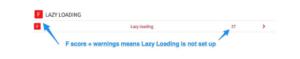
You helped me with my lazy load on my site but it appears that it is not working for the blog pages as they are coming back through the speed analyzer as F for lazy load. Can you explain why that might occur?
If you’re getting warnings on a page, start by inspecting the code to make sure it’s correct on the image elements, and check for console errors to make sure the script is loading and there are no javascript errors.
My guess is that you either haven’t switched src to data-src on the image elements, or added the lazyload class, or the script is not loading on that page, or the images are being loaded by a 3rd party app.
Hi, I’ve followed the instructions but the lazyloading isn’t getting recognised here http://www.dedicatedfitnessxl.com
I’ve checked the js working and it is there. data-src without src being there and also the right class. I’m stuck at what I’m missing.
Hey Dino, it looks good to me. Lazy loading will only apply to images under the fold. So for images close to the fold it will depend on the device being accessed.
Another possibility is that if your home page slider / banner is slower to load (javascript based, video, etc) then images under it may be moved up during load, then pushed back down. If they get moved up then they get loaded.
As long as you don’t have the “src” attribute (and use “data-src” instead), and have the lazysizes script loading in the
, then the images will lazy load when they’re able to (in most cases, other than the exceptions I mentioned).Joe,
I believe I followed the steps correctly to make my images lazy load but I’m not confident it worked even though my site seems faster, Page speed tests say otherwise.
https://analyze.speedboostr.com/result/fhv0yxw144
Let me know what part I missed, I bet it’s something minor.
Kyle
If the images are still getting flagged in the Analyzer, they’re still loading on page load.
It looks like those images still have the src attribute attached. Now that you have the data-src attribute, the image will get loaded in when it comes into view, so you can remove the src.
Give that a try, should fix it 👍
Where do I remove it from? And is it just src or anything connected to the “SRC” as well? Also this is from lazysizes.min.js? The asset I created that is where I am removing it?
You can find the image src attribute in the code wherever your theme files are loading an image. The most common areas are the collection thumbnail, product page, and the home page.
Lazysizes is the javascript library that reads the data-src attribute, and loads the image (injects the src attribute) when the user scrolls it into view.
Having a src attribute tells the browser to load that image, so by removing it and replacing with data-src, you prevent the image from loading on initial page load, so it can be lazy loaded instead.
Hi Joe. I’m not a developer but I tried to follow the above tutorial and seem to have screwed up my website. My images are appearing only when I’m moving my cursor over them. I need to undo this. Please help!
Hey Varsha, I took a look at your site and found the problem: I see you have a call to the lazysizes.min.js file on your site, but the link is broken. This probably means that the code you have in your theme.liquid file is incorrect, or you haven’t uploaded the lazysizes library into your theme Assets folder.
Try those 2 things. If you get stuck you can contact us. Also, I recommend duplicating your live theme whenever you make code edits, this way you can test the edits before they publish live :)