- Beauty is truly in the eye of the beholder with Fonts; this proverb really drives the point home.
- Using fallback fonts that are already on the device (held by the owner and, therefore, websafe) equates to a faster website and a more familiar or ‘beautiful’ experience.
- Due to the implications of sizing and kerning (spacing between letters) :- Mobile browsers will begin rendering once the font file is available on the device, and not a second before. 👉 The above is critically important for a store owner to understand, and is the most common oversight we encounter in optimizations.
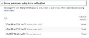
font-display will do the work for you when it’s configured correctly.
💡 It’s all about the load time and speed of a fallback – Your branding should contain personality and can include entirely custom fonts or drawings or any kind; it’s the loading of your page copy that we’re talking about here.

Fonts are used on the selectable page text displayed on your store, for your navigation, blog posts etc.
Best Practices:
- Fonts should ideally be uniform with the user’s existing interface, going as far as using the font that is already on their iPhone or Android etc that they have been looking at for years as the fallback, will instantly make the user feel at home, due to familiarity.
- Less is more; each font has network overhead. Aim for 1 custom font or 2 at the most. Minimalism is good.
- Host the fonts on Shopify CDN. Do not use third parties. This has been recommended by Shopify for several years now.
What’s a Fallback?
💡 The font that will be swapped, too, is to be used in place while the custom font file is loading, or if there are problems loading it on the device.
This means you get the best of both worlds. You can use a custom font,
and a websafe font and not have to wait for the file to download for rendering to begin!
Let’s take a look at X’s stylesheet (Formally Twitter) – you can see the production CSS code in the screenshot below, the use of their own custom font
TwitterChirp, and then the websafe system fonts are listed, with the Apple System font first in the fallback chain.
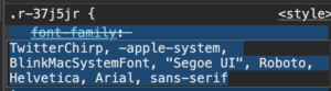
X’s CSS makes great use of a fallback chain
For the most common iPhone and iPad native display, we can use this chain:
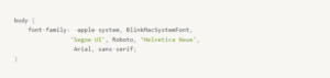
The good news is, the above also works on Windows devices! Because in this example,
'Segoe UI' is a font commonly used on Windows, due to the fallback; it will be used when the
-apple-system font isn’t available. You don’t need any more code to detect the device, this is built into the parser. There’s no additional overhead, just a syntax!
To go a step further, the
Roboto and
'Helvetica Neue' fonts are included for additional cross-platform compatibility. The final fallback is
Arial and then a generic
sans-serif as a last resort for older platforms. This means we’ve covered all bases now.
💡 To select your websafe fonts of choice, go to this link here: https://www.w3schools.com/cssref/css_websafe_fonts.php
Set and Forget – Use a Websafe fallback and totally forget about this problem.
It really is as simple as that. Unfortunately, for the execution, it’s sometimes not that simple.
Often enough, this is due to the emotions involved in attachment to a font. To help make the decision easier – the requirement for a fast Mobile store is as important as having a unique identity and brand. A common fear is when removing or changing fonts, you remove a piece of your brand.
Don’t let your mind run away with you; it’s just the page text we’re talking about here!
Look again when you are shopping next; all the stores are doing it. Custom fonts for page text are really a thing of the past. This doesn’t mean you cannot use them in graphics, logos, and social media posts. It’s just the page text of your website we are addressing here, and it’s only the fallback, you can still run a custom font as your primary.
Using Google Fonts (or FontAwesome and other third-party providers)
Using Google Fonts isn’t recommended by Shopify, as it requires an additional request to be sent to a third party, and that’s been the case since 2021.
It’s best to use the fonts available on Shopify (via the Theme Customizer) or a
websafe font, and to keep in mind that it can become very confusing as even Google’s own Tool – Lighthouse, which is used in PageSpeed Insights, will report their own domain as a cause of main-thread blocking, albeit for a mighty zero milliseconds, which seems like an error on the report that could be safely ignored.
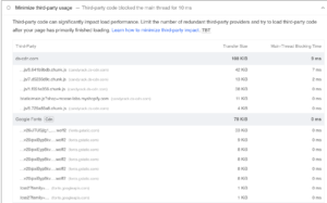
Google font’s is listed in the audits for TBT on Pagespeed insights.
After caching, it’s true – the fonts exist in the
memory cache and have 0ms to load (bottom red arrow), but rendering still begins at nearly
1500ms (top red arrow) due to the way the browser works.
This client is using the
sans-serif fallback, which is a great catch-all, but even with having fallback and locally hosted fonts, the cost of having numerous additional fonts enabled in the CSS, still delays the render by over a second, and that’s the difference between obtaining a high score on Mobile or not.
Checklist for Next Steps
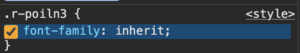
- Start by viewing your store in the developer console (right click, inspect element)
- Open the element tab, and select the body tag of your page markup, or any element containing page text.
- Filter the list for
font-family and identify the CSS inheritance chain.
- Make your code adjustments from here, via modifying the CSS or changing the settings in your Theme Customizer (these are theme dependent; official themes will have full Shopify font support)
- Clear cache by refreshing the page several times after saving your changes, then re-audit your store and check the developer console to see.
💡 Need help? Are changes not working?
Contact us and consider it done! We’ll optimize your fonts and ensure you’re using best practices.
Some of our posts contain affiliate links, meaning Speed Boostr could receive a commission if you sign up through these links. We only recommend apps and services we believe in. Please read our affiliate discaimer for more information.