Have you ever done a design contest? They’re fun!
We actually did this for the Speed Boostr logo (step by step walkthrough with screenshots below).
I work 1 on 1 with designers for certain projects (usually if I have a clear idea what I’m looking for), and do design contests for others (when I want to get ideas / feedback from multiple designs).
99 Designs and 48 Hours Logo are my go-to platforms for design contests.
Design and Audience Connection is Key
I hear this a lot: “My site is getting traffic but my conversion rate is really low”.
This usually means one (or more) of these need to be addressed:
- Low quality traffic (not targeting the right audience)
- Low quality product photos / presentation
- Lack of branding / story telling
I think any product will sell if you have good branding and target the right audience.
Let’s take a look at 2 core components of branding:
1. Design
Design builds your brand identity and makes you memorable.
Good design builds trust and projects higher quality.
Think of your website and branding like a physical store – you want to provide a warm welcome for your visitors so they’re comfortable and want to hang out and buy from you.
2. Story Telling
Shopping is more fun when you’re on a site with a fun or interesting story.
People connect with brands showing personality.
If a customer wanted to buy something generic they’d probably go to Amazon… when a customer buys from your online store, there’s a chance to build a connection and long term relationship.
Tell your story, share why your brand is different, connect with your audience.
Thought experiment on those 2 points:
a) Consider landing on a site with a plain text logo, black and white color scheme, and no color contrast in the design.
Even if there’s an about page, you might not stick around long enough to visit it… because hey it’s the internet and we short attention spans 😃
b) Now consider landing on a site with a pro looking logo with a nice graphic, some color contrast in the site design, a prominent about page, and some welcoming text on the home page to tell you what they’re all about.
Within seconds you’ve made a decision to trust or not trust this site. Obviously #2 is going to keep visitors hanging around more.
I come across scenario #1 fairly often enough, but I understand it – bootstrapping is tough but if you’re going to launch an ecommerce business, give your brand a fighting chance and at least have a nice logo going for your launch.
Why a Professional Logo is Key
- Make a good first impression
- Increase conversion rate
- Be more memorable
- Be different
A good logo pays for itself by increasing conversion rate.
99 Designs vs 48 Hours Logo
I’ve gotten logos and projects from both sites, and for me it usually depends on budget and scope.
Logo design contests start around $100 (48 Hours Logo) – $300 (99 Designs).
I usually like 48 Hours Logo for single logo projects, but prefer 99 Designs for larger projects like print materials / brochures, app mockups, website mockups, etc.
Logo Before / After and Contest Walkthrough
First how about a before/after, these are always fun.
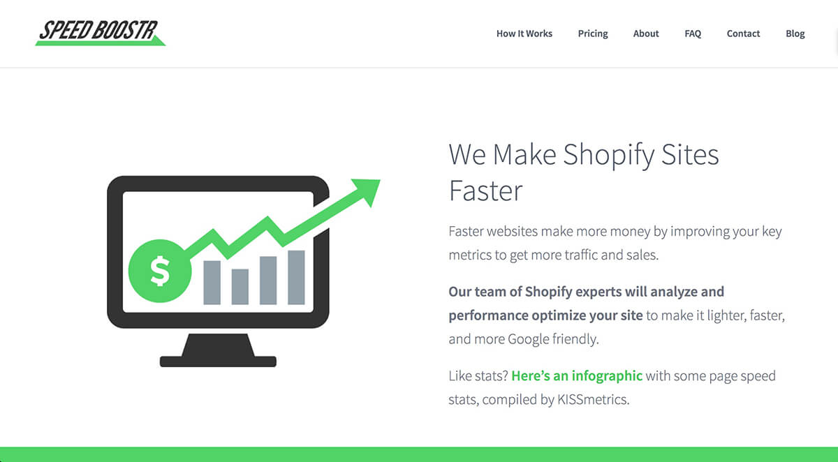
Speed Boostr logo and home page BEFORE professional design:
Speed Boostr logo and home page AFTER professional design:
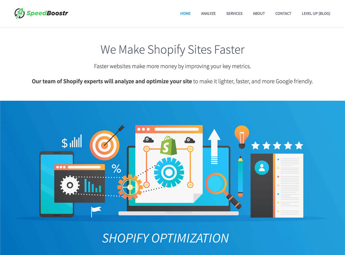
World of difference eh!?
The “before” design was me making a quick text logo graphic in photoshop, then grabbing a stock image for the hero banner.
I’m actually a little embarrassed at the “before” design haha but hey Speed Boostr used to be an experimental side project so that’s my excuse 😅
Even though we are the same hard working, experienced developers whether using design 1 or design 2, I think design 2 portrays a more professional and inviting organization.
How to Run a Design Contest
We used 48 Hours Logo for the new Speed Boostr logo.
Here’s how to execute a design contest, using our contest as an example:
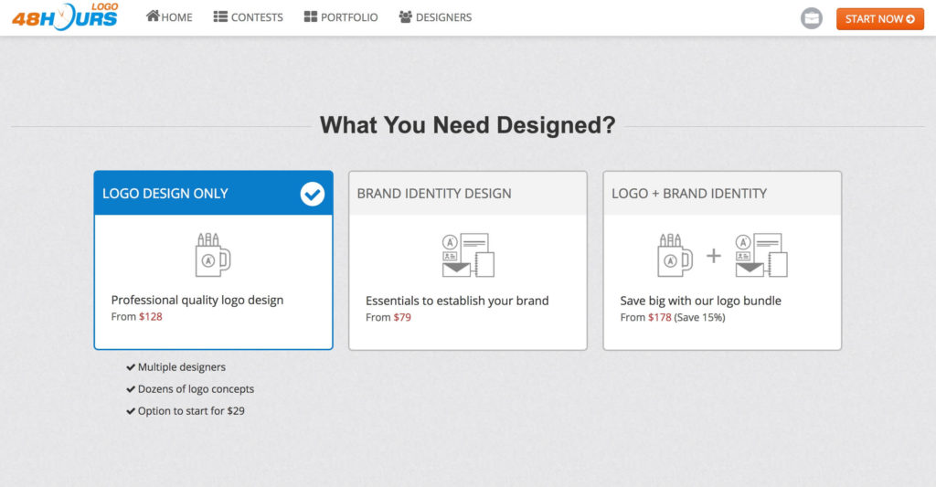
1. Click Start on the 48 Hours Logo home page, then select Logo Contest
2. Give a project description
This part is key to represent your brand. Give a detailed description on the logo style you want and how you want people to feel when seeing it.

3. Choose the prize
Higher prizes attract higher designers. I chose their highest package to attract the platform’s best designers.

There’s an option to select “guaranteed contest”. If you don’t select it, you can back out of the project if you don’t like any of the designs. I always make the contest “guaranteed” to attract better designers and get more time investment, since they know the prize is guaranteed.
4. Pick some styles you like
You can select from existing logos to give designers an idea the style / feel you’re going for:

5. Set your contest live!
Once you confirm your contest, you can see your contest page, entries, and the timer (you can customize this to select how many days you want the contest to run for).

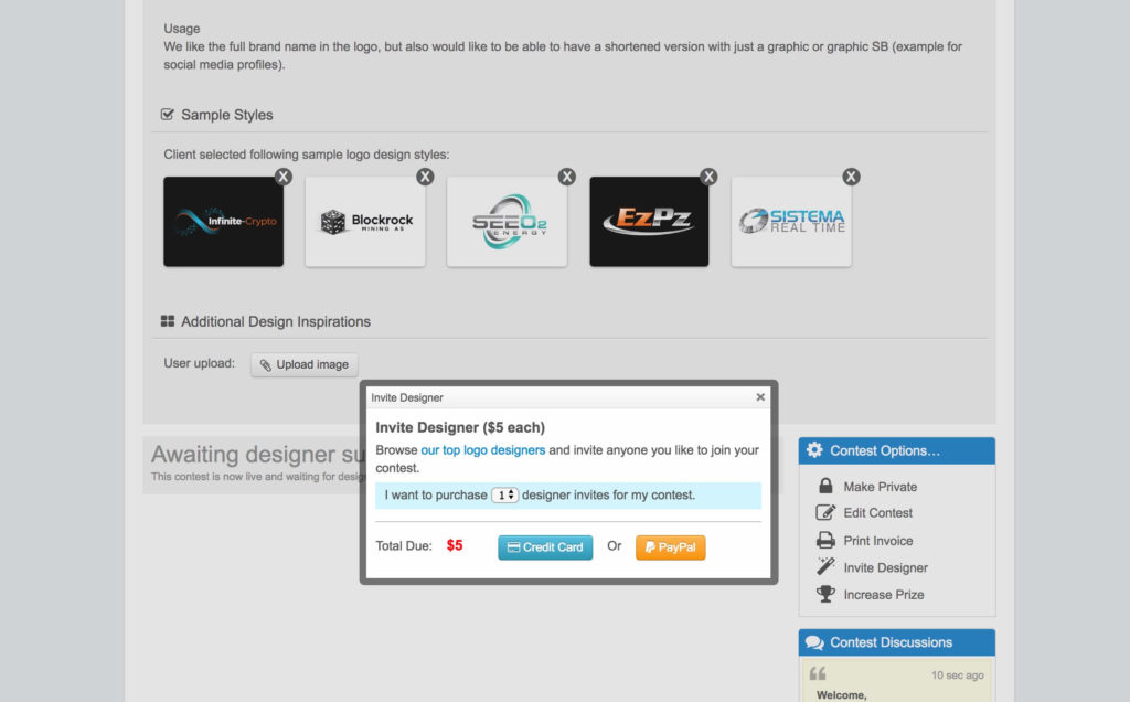
6. Invite additional designers
I’ll usually invite a couple other designers. Either designers I’ve worked with in the past, or I’ll browse some profiles to find designers I think match the style I’m going for.
7. Get submissions, give feedback
You’ll get a variety of design submissions, some good some bad.
What I do is look for the designers that have a visual good quality and get the idea we’re going for, then give comments and feedback to revise.

8. Revise, revise more, then select a winner
After you give feedback and the designers give more submissions, your final design will start to formulate.
From there you can either select finalists to enter the next round, or if you see a design that nails it, you can pick the winner right there.
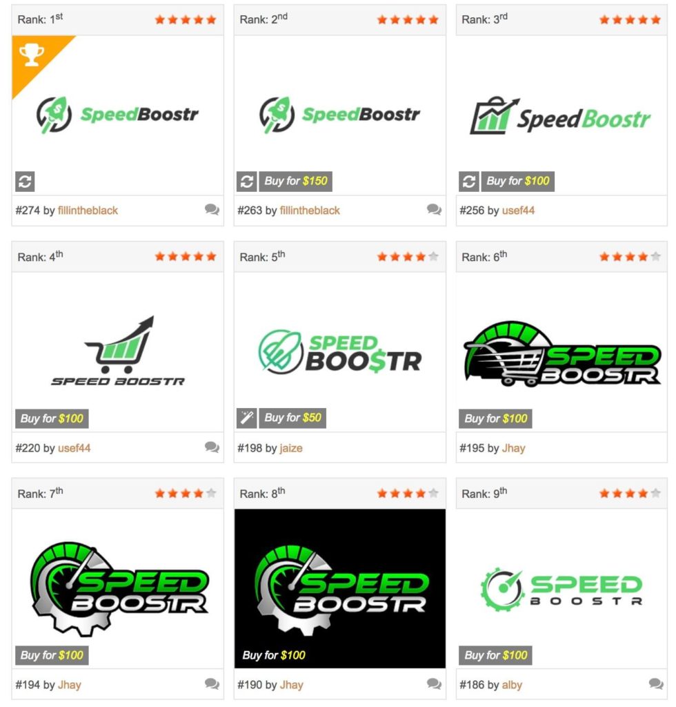
Here’s our winning design along with the other finalists:
9. Lots of designers enter your contest
Overall we had 65 designers submit a total of 247 entries to the contest.
You can see how this is a great system if you’re not sure the exact design and icon your going for. The amount of diversity gives you plenty of ideas and viewpoints to craft your perfect logo.

