Updated July 13th, 2019
Did you know that having video on your site can help improve SEO? The logic is that videos are the most engaging content, and when people watch video on your site, that increases their “dwell time” (or time spent on page). Great, so let’s embed some videos! By default your video likely won’t fit on the page perfectly for all screen sizes (unless your theme has it built in). To illustrate, I clicked “Share” then “Embed” on a YouTube video, and here’s the code I got:<iframe width="560" height="315" src="https://www.youtube.com/embed/yvEzAx1Ij6M" frameborder="0" allowfullscreen></iframe>And the video with that code pasted here:
1. If you’re on a phone, it’s probably cut-off 🤨
2. If you’re on computer, you can see the whole video, but it’s a little small eh?The Solution
We can add some code to make the video grow/shrink with the screen size and maintain it’s original ratio, like this:BLAM! Drag your screen to resize and watch the video automatically form to the container size.
The Code Snippets
HTML
<div class="responsive-video">
  <iframe width="560" height="315" src="YOUTUBE VIDEO LINK" frameborder="0" allowfullscreen></iframe>
</div>
CSS
/* -- Responsive video embed -- */
.responsive-video {
  padding-bottom: 56.25%; /* for 16:9 ratio */
  padding-top: 25px;
  position: relative;
  height: 0;
}
.responsive-video iframe,
.responsive-video object,
.responsive-video embed {
  position: absolute;
  top: 0;
  left: 0;
  width: 100%;
  height: 100%;
}
Where to put the code
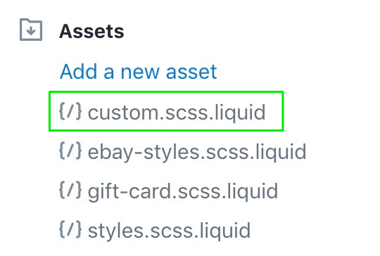
Let’s start with the CSS. Copy/paste the above CSS code to yourcustom.scss.liquid file (or whatever you use to add custom CSS).
 If you don’t have a custom file, I recommend creating one to keep separate from your theme default CSS. But for a quick workaround, you can just paste the CSS code snippet at the end of your styles.scss.liquid file (or whatever your theme’s stylesheet is called).
And the HTML: Now whenever you embed a Youtube video just copy/paste the HTML snippet above and place line 2 with your embed code. Easy.
That code will make the video grow responsively to fit the container it’s placed in. If you want to limit the size the maximum size of the video, you can add an outer wrapper like this:
<div style="max-width: 600px;">
  <div class="responsive-video">
    <iframe width="560" height="315" src="YOUTUBE VIDEO LINK" frameborder="0" allowfullscreen></iframe>
  </div>
</div>
How to responsively embed Vimeo videos
Unfortunately it doesn’t work for these… nah just kidding 😂 Here’s a Vimeo video with the same technique applied:Lazy Loading Video
If you have lazy loading enabled with the “lazysizes” library (this is what’s used on the videos on this page), you can lazy load your video by swapping indata-src for src, and adding class="lazyload" to the iframe element.
Now if your video is “under the fold”, it won’t contribute to initial page load, making your page faster and more Google friendly.
If you don’t know what lazy loading is, check out Lazy Loading for Shopify.
If you’d like us to set up lazy loading for images and videos on your site, checkout our Lazy Loading optimization service.
